Policing Campaign
Engaging activists effecting policing reform
Time Scope
4 weeks
My Role
User Research, Content Strategy, User Experience Design, Prototyping
“How might we present information about policing reform in an accessible, engaging, and useful digital experience?”
Overview
Challenge
The Leadership Conference, a nonprofit coalition of 200+ organizations that advocates for civil and human rights issues, had less than two months to launch a multi-channel Policing Campaign aimed at improving community policing in the United States. The hallmark project of the campaign was a 150-page Policing Reform Toolkit, written for community organizers and anyone inspired to effect policing reform in their communities. Already written and in the process of being laid out as a printed handbook, my challenge was presenting the toolkit to online audiences in an engaging, intuitive, and usable way.
Solution
As the UX designer, I interviewed target users to find out the day-to-day processes of community organizers, as well as their constituents’ needs. Some key insights I learned from research are that creating lasting change often takes years, and requires engaging new participants regularly. It also involves holding meetings in places where attendees are looking at information on mobile devices, and in many cases, English is a second language for meeting attendees. In the solution I designed, I recommended paring down the text for the website, summarizing what each section of the toolkit could guide users on, and allowing users to download each section of the toolkit, instead of having to download the whole 150-page toolkit to search for pertinent information.
Process
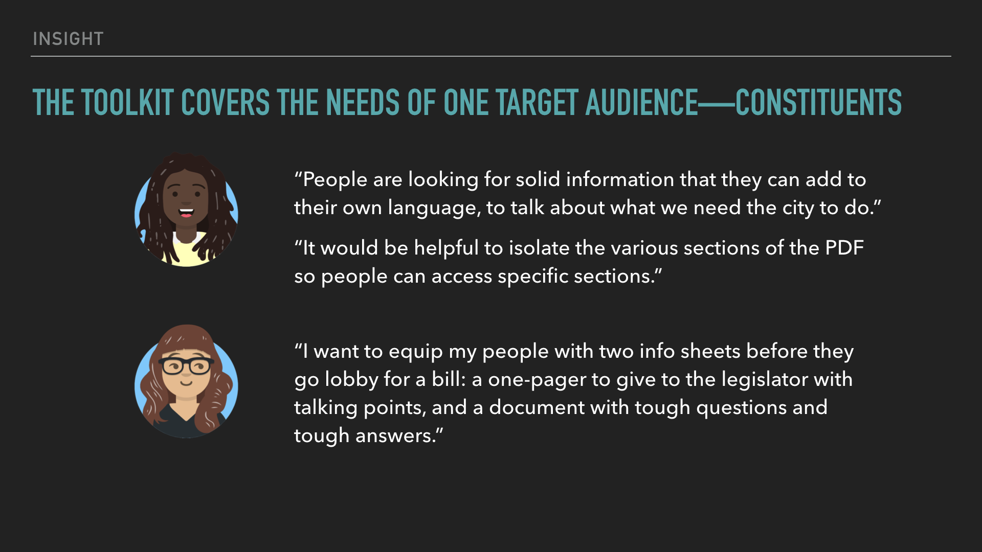
With limited time, user research wasn’t built into the project plan. I advocated for its importance, and conducted interviews with community organizers in Dallas, TX and New Haven, CT, and with an ACLU staff member who worked with target users frequently.
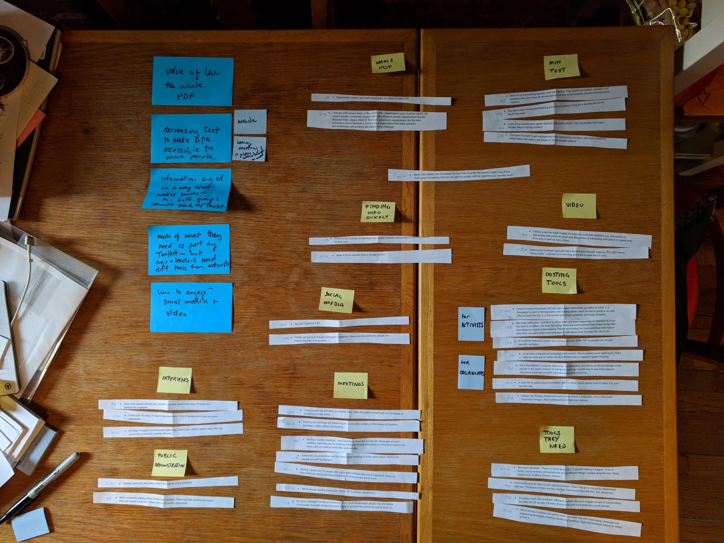
With only 4 weeks to complete the UX design, printing and cutting up my interview notes was the most efficient way to synthesize my research.
Meanwhile, I conducted a comparative analysis of other websites whose goals were to empower activists. Lastly, I interviewed stakeholders at The Leadership Conference to ensure I understood their goals and perspectives.
Determining the information architecture and content strategy, and then mocking up wireframes and prototyping, relied heavily on the insights I learned from my in-depth interviews.
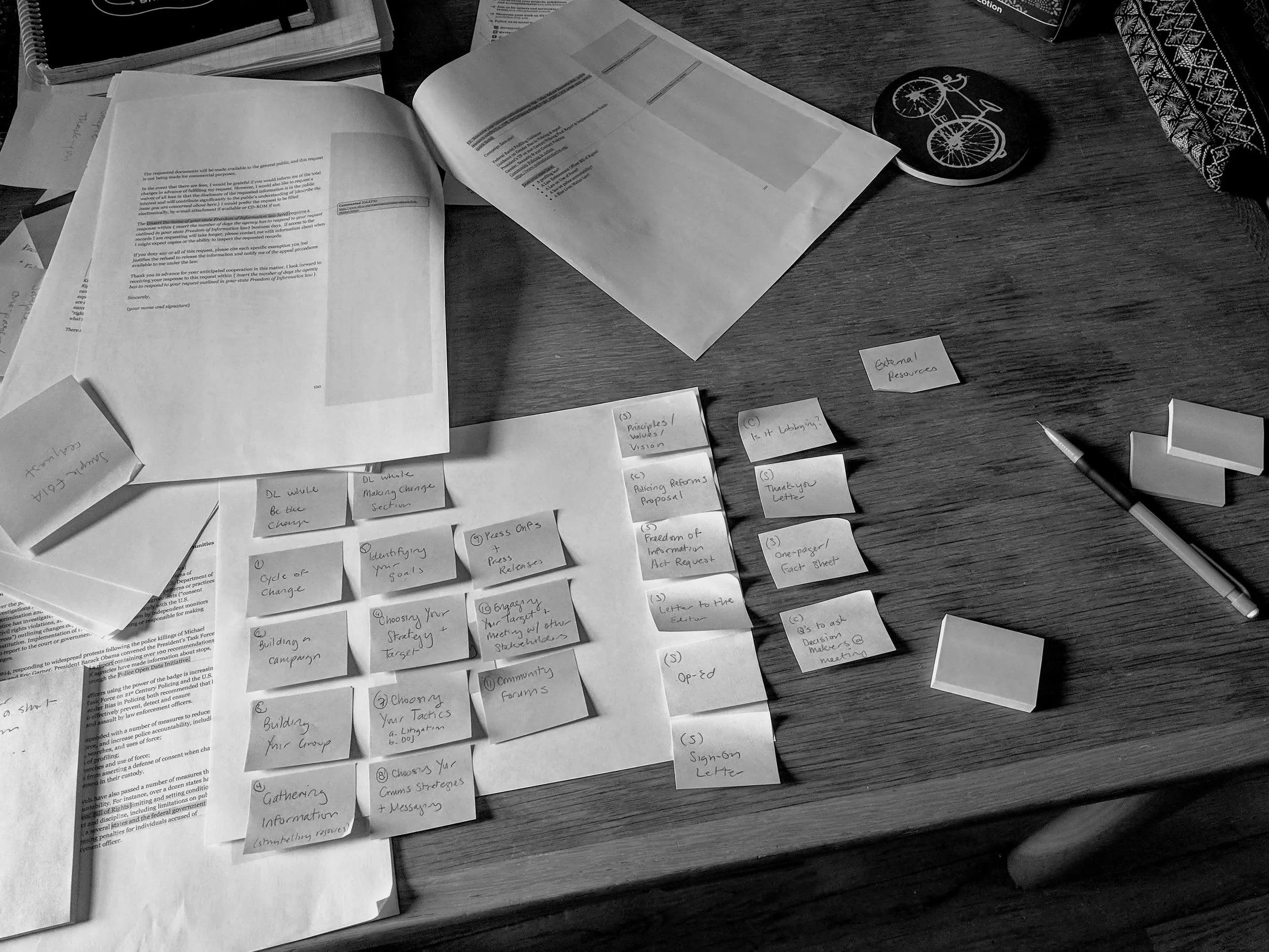
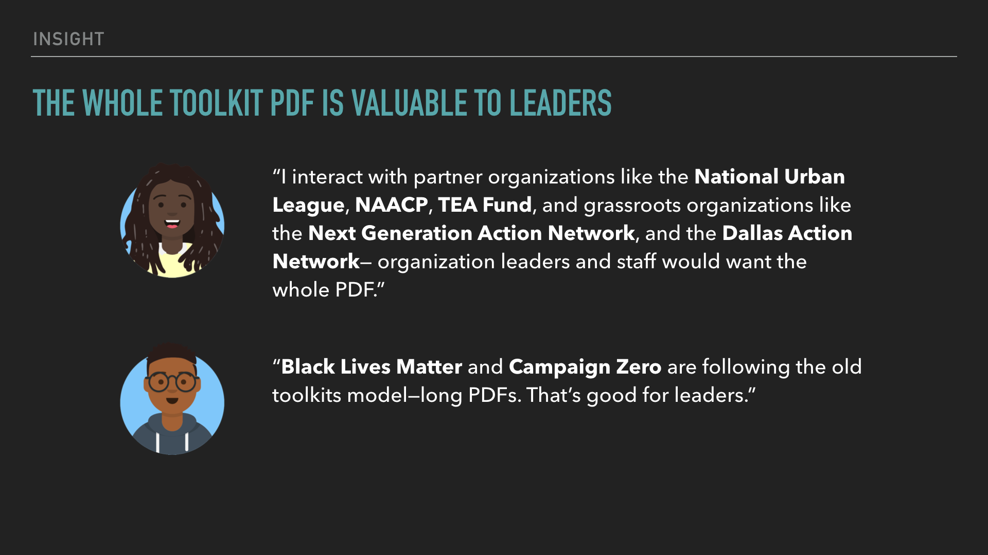
When it was time to present the concept to stakeholders, I made sure to weave in my research findings, backing up my design decisions.
Key Insights & Prototype
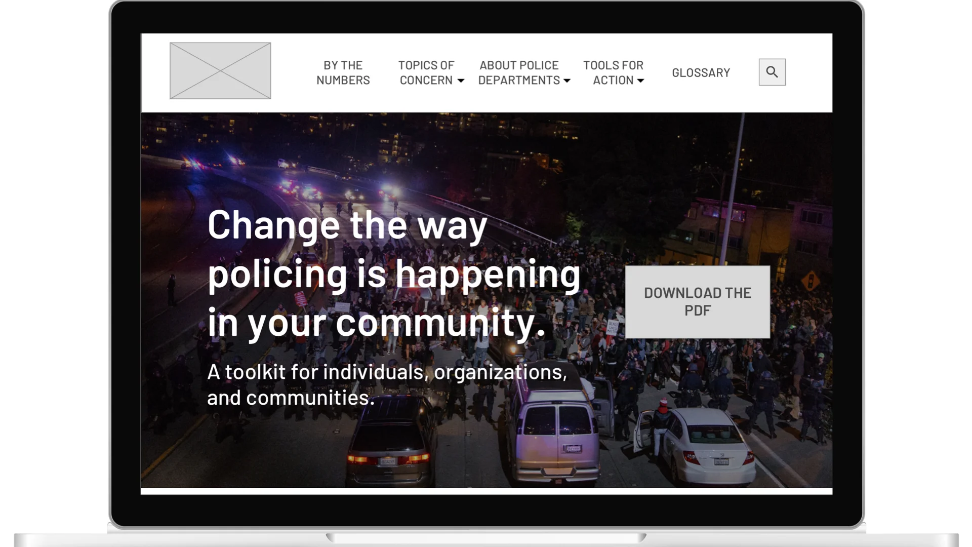
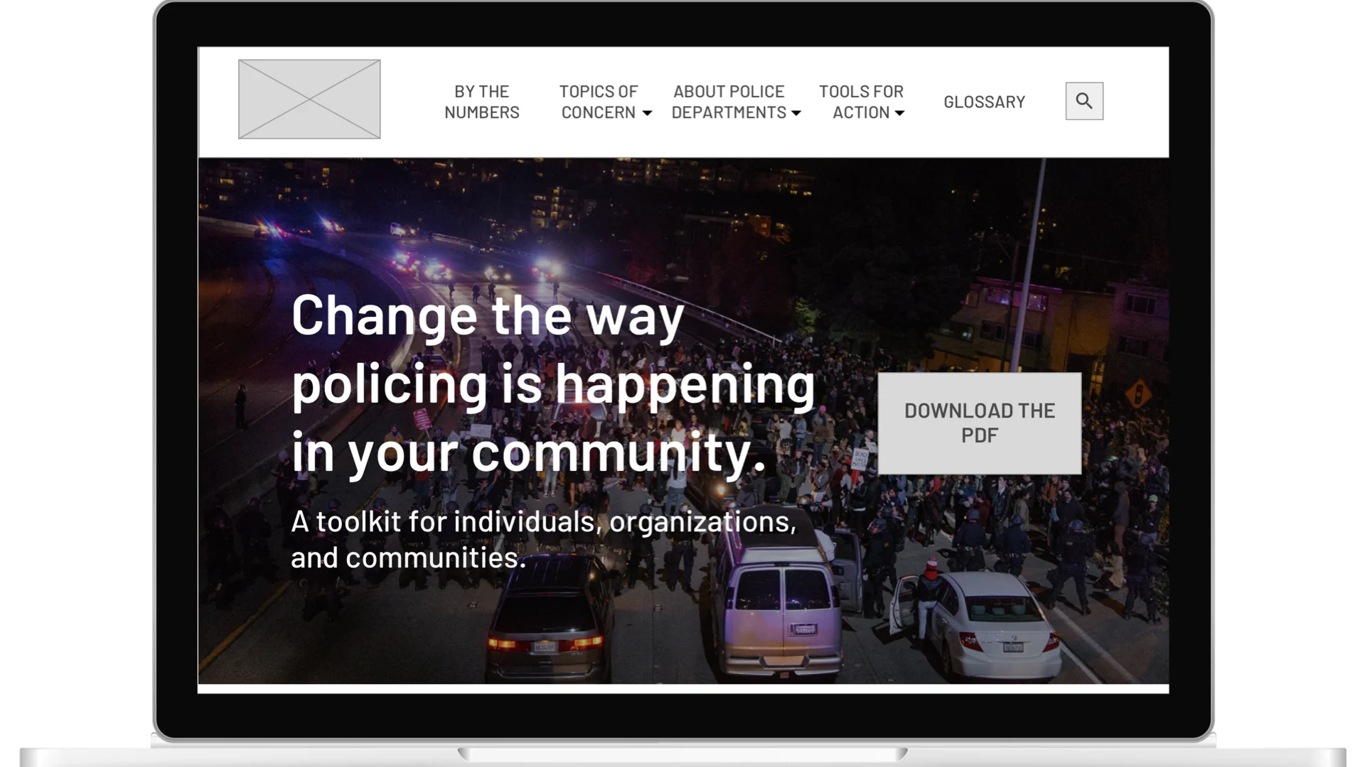
The PDF of the toolkit is accessible from the homepage, for those looking to page through its rich content.
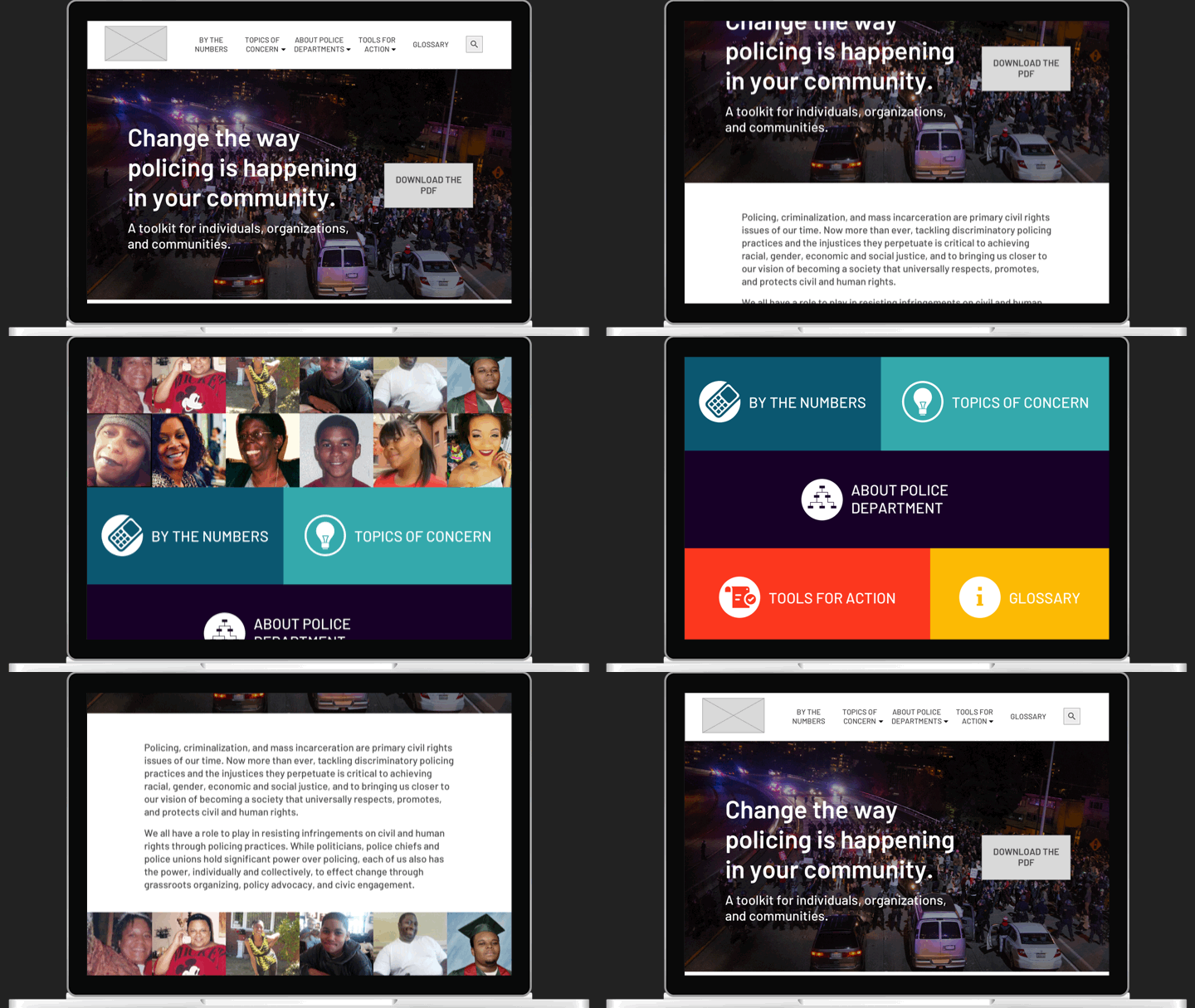
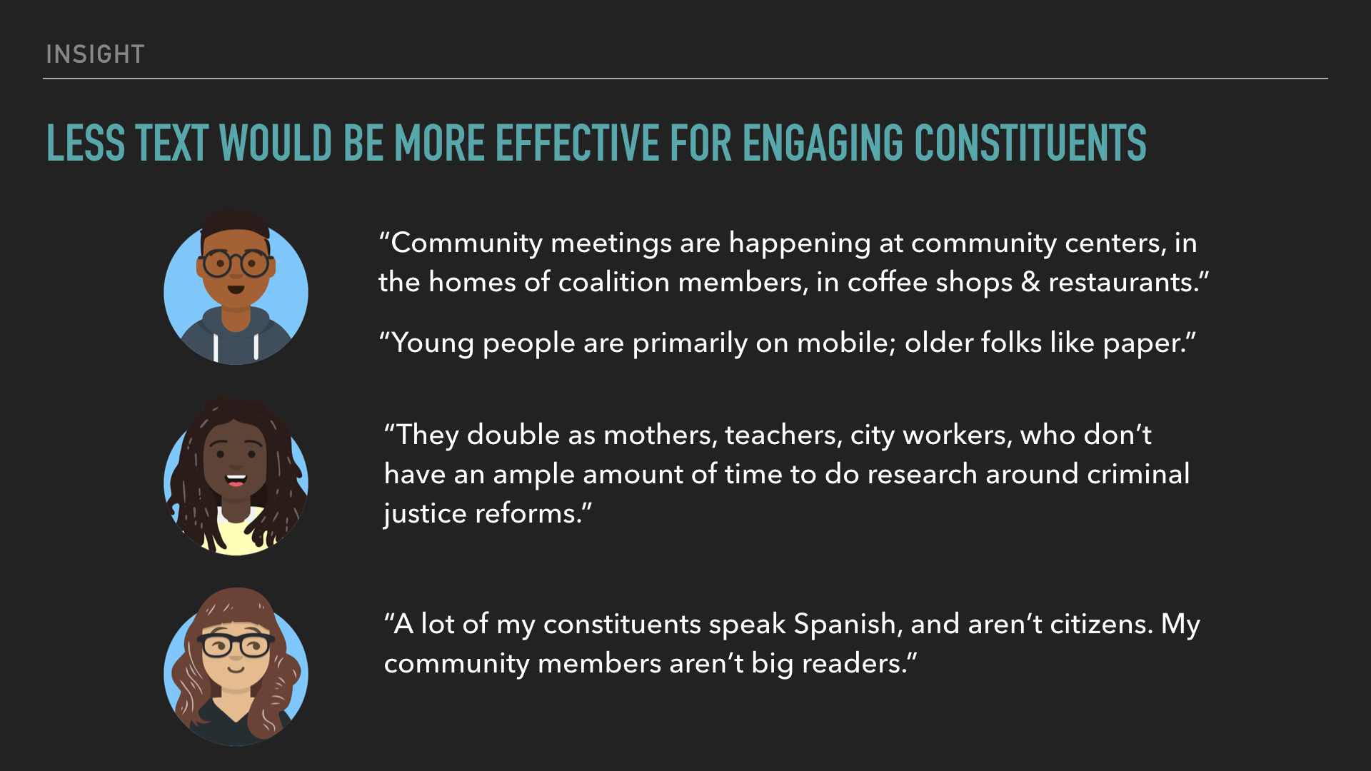
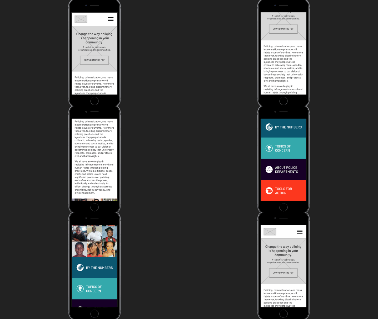
I recommended shortening introductory text on the homepage and for each section, keeping in mind mobile screen sizes and users’ attention spans and English literacy levels. We also discussed the high value a Spanish version of the site would provide.
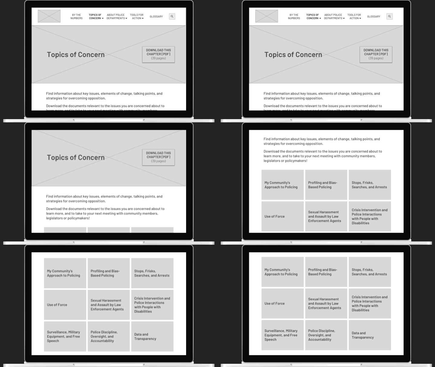
Longer sections like Topics of Concern are clearly labeled. Users can download the whole Topics of Concern chapter of the toolkit, or dive in by individual topic.
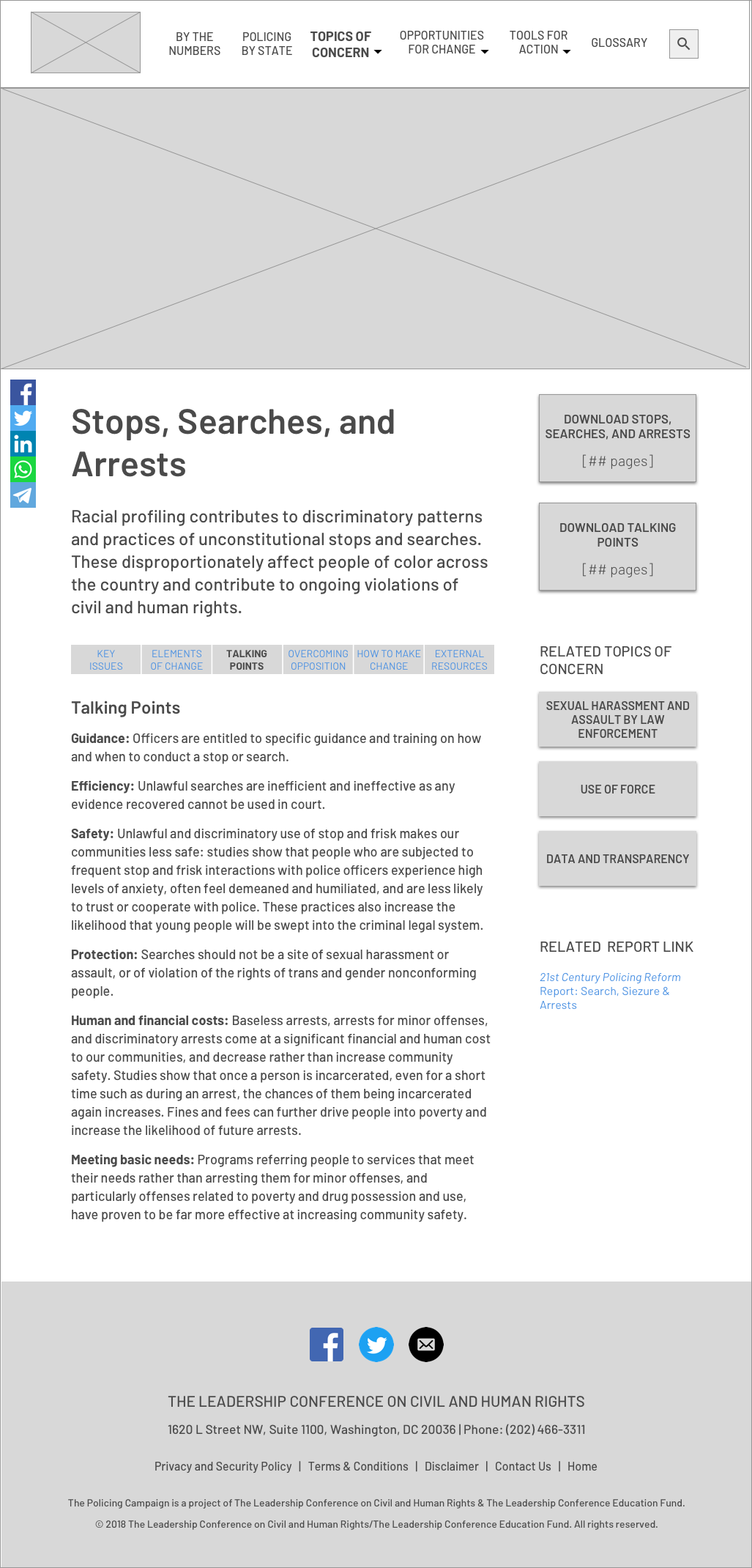
For example, clicking into a subsection like Police Discipline, Oversight & Accountability, visitors can learn about the key issues, and perhaps relate back to their own experiences. In the first design, visitors could then open the PDF pages of that subsection alone to access talking points, counterpoints for overcoming opposition, and descriptions of what reform would look like.
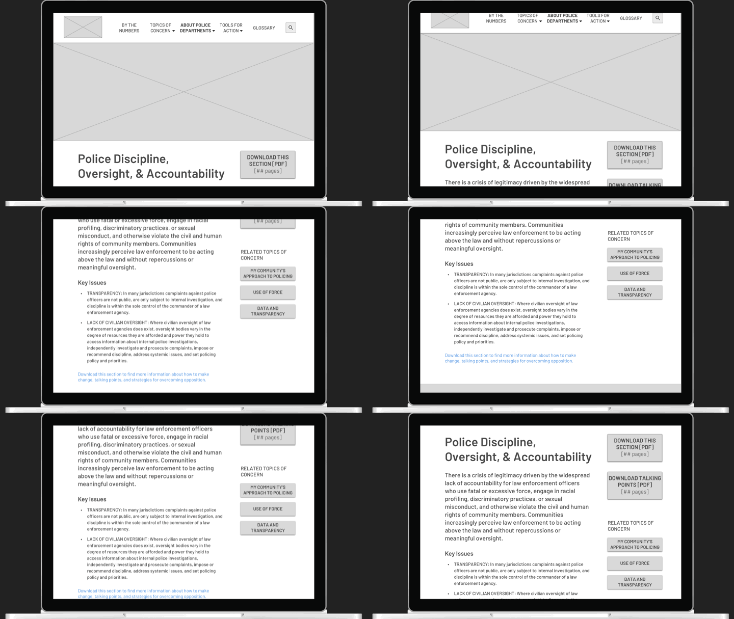
In the second iteration, informed by feedback from stakeholders, all of the sections are presented on the website, organized by tabs.
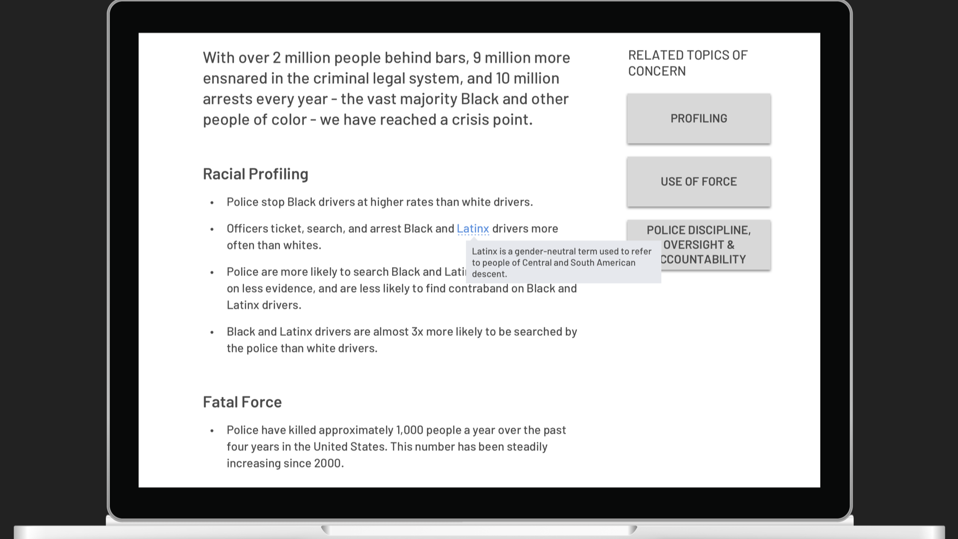
Another feature to help users comprehend new information are tooltips, revealing definitions of key terms that can be found in the toolkit’s robust glossary.
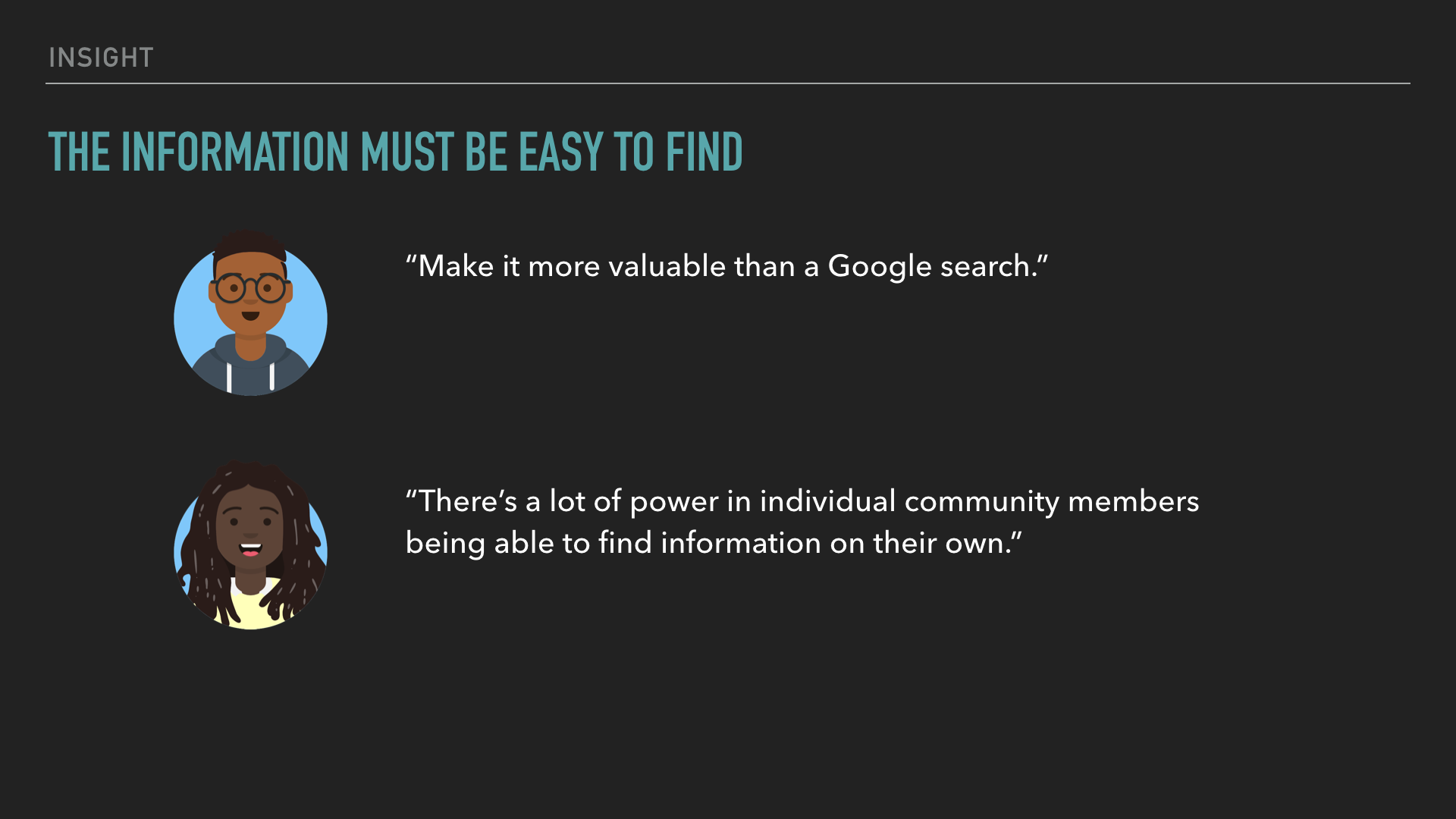
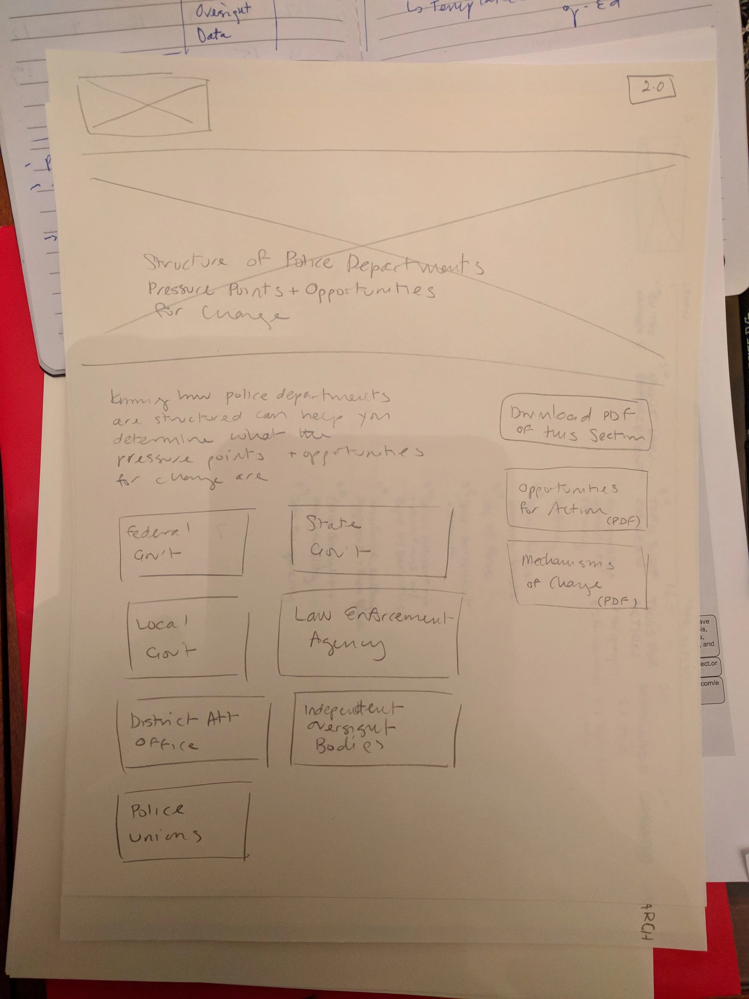
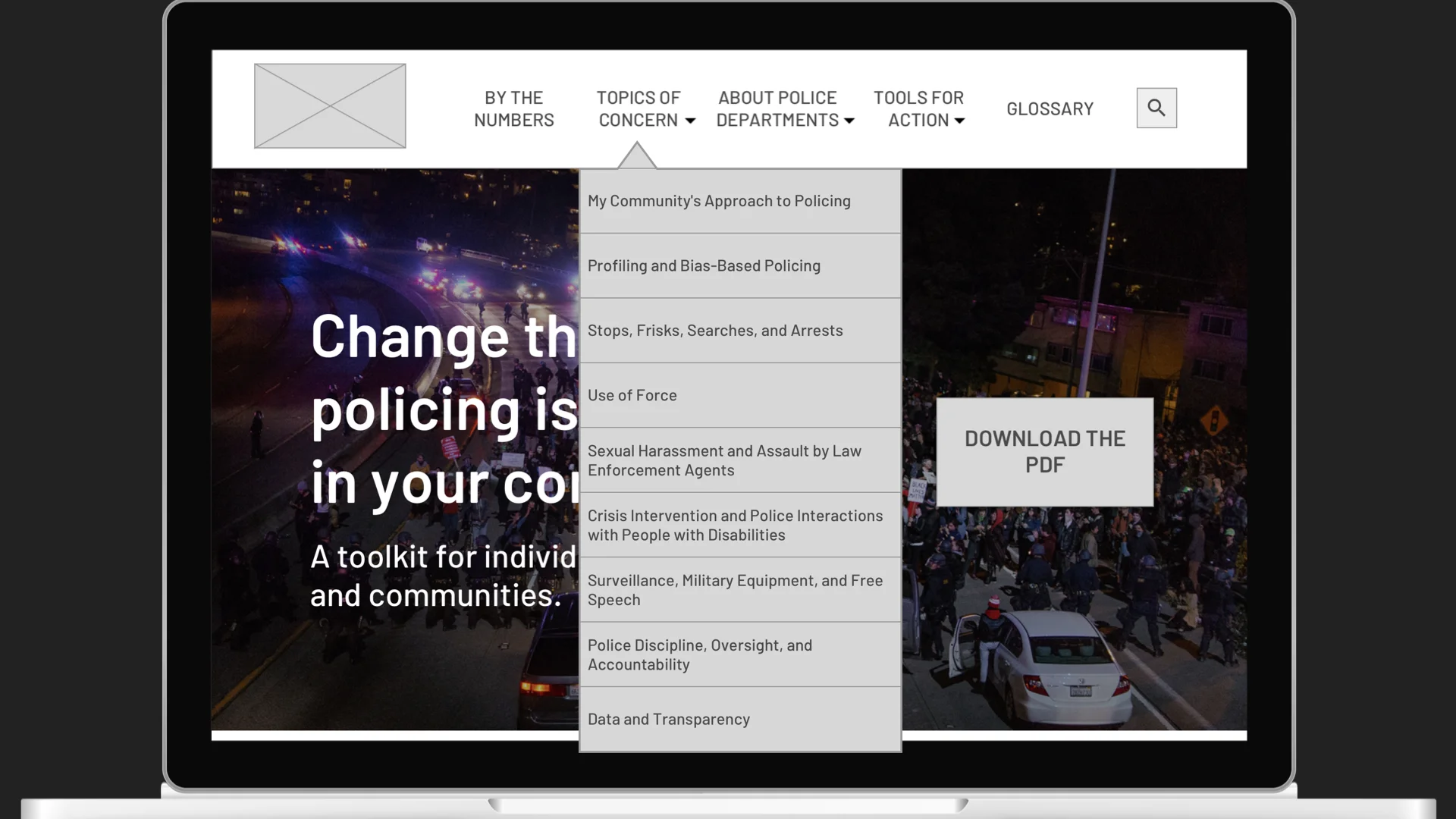
Some of the section titles didn’t translate well from print to web, or were too long for a navigation menu. I revised some of the titles, e.g., shortening “Structure of Police Departments, Pressure Points, and Opportunities for Action” into “About Police Departments,” and reorganized how the content was presented, in order to fit under four menu items.
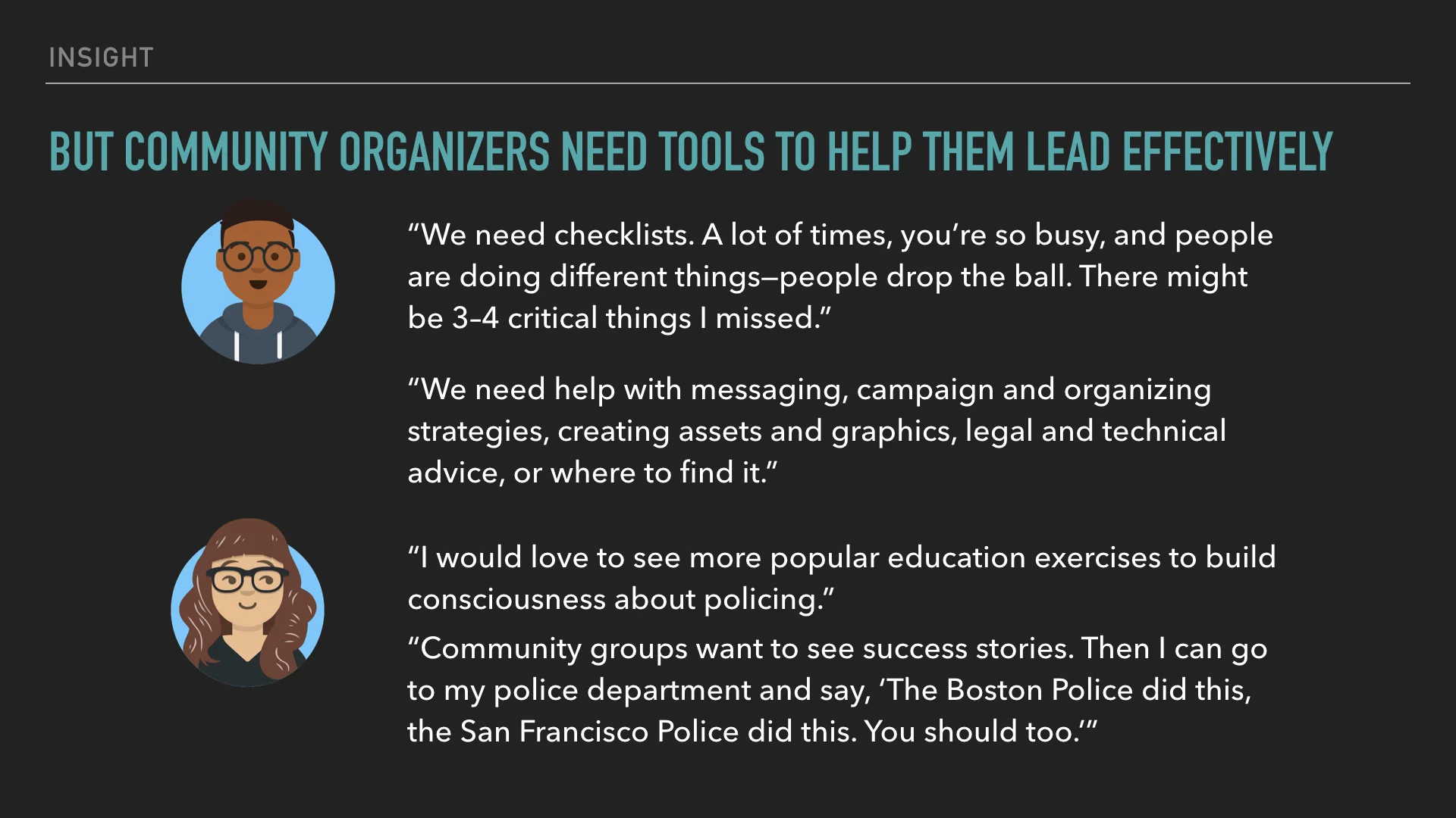
I wanted it to be clear to community organizers that if they were looking for tools to help them lead, they could go straight to the Tools for Action section of the site.
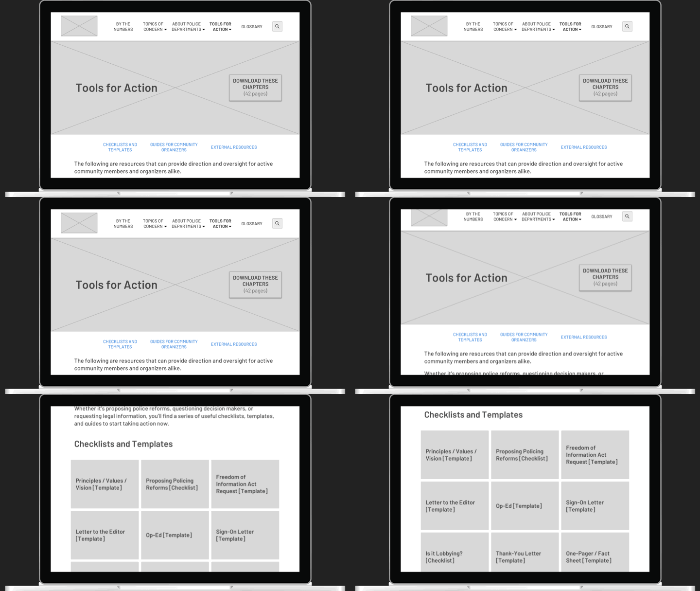
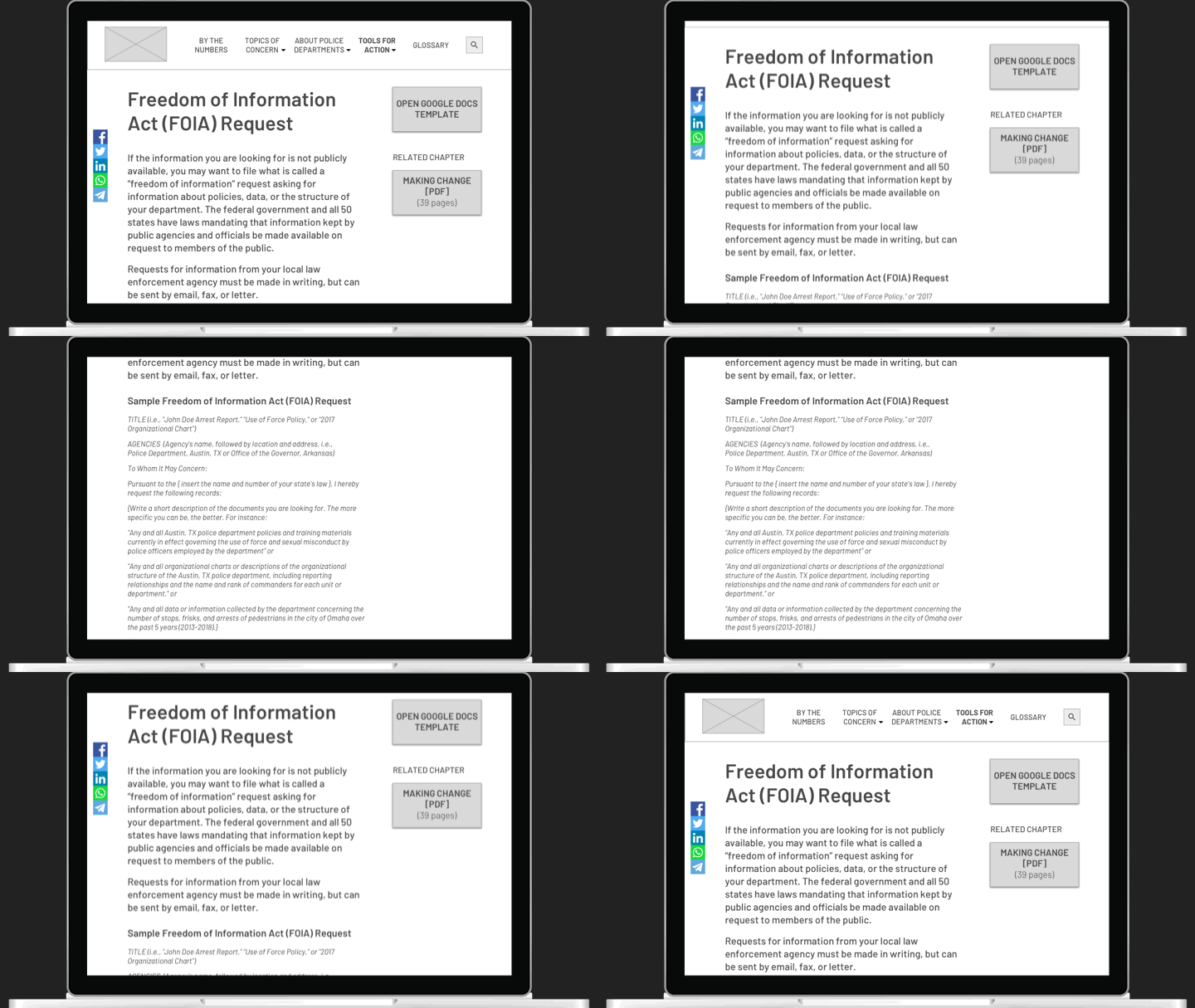
Here, they can find guidance as well as templates offered as Google Docs they can download and customize quickly.
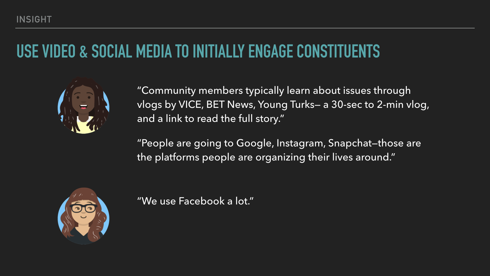
Social media can never be ignored in conversations about how to engage people, especially younger generations. Though our stakeholders were aware of the need to incorporate a social media strategy when rolling out the campaign, it was important for them to learn about how young people are consuming news as well. I recommended engaging with news sites like VICE, BET News, and The Young Turks, to more effectively promote the toolkit.
Iteration & Handoff
After the presentation, there was one major round of iteration, which mostly comprised adding the tabbed structure to the Topics of Concern subsections. I updated the desktop and mobile wireframes, and created tablet mockups before handing off my files to the visual designer and developer.
Lessons Learned
Since the launch of the project was delayed, I was unable to stay on until the end of the project to provide UX guidance and quality assurance. I’m grateful my stakeholders and team were receptive to my advocacy for user research. Had there been more time, it would have been helpful to speak with activists themselves.